
Making CRM look like it came from the same shop as Sanctum Tasks
Sanctum Tasks had a design system. CRM had a generation gap. For a while, that was the state of things, and we lived with it - the way you live with a sibling who showed up to the family photo in a different decade's outfit.
What changed in June is the kind of change that is easy to miss in a changelog and impossible to miss in the browser. The CRM is no longer wearing the legacy Best Jobs / TA skin - the purple gradient sidebar, the rainbow stat tiles, the Font Awesome mismatches, the inline <style> blocks wedged into the layout. It is wearing the same token-and-chip language that Sanctum Tasks has been shipping since early June, with the same dark navbar, the same Bootstrap Icons, the same semantic chips. Two products, one shop, one voice.
This post is the long version of that story. It is about why we did not invent a third design system. It is about what "visual parity" looks like in practice, page by page. And it is about what we did not do, which is just as important as what we did.
Tasks was already the reference language
Sanctum Tasks moved to Bootstrap 5.3, Bootstrap Icons, semantic chips, a dark navbar, and a skin layer with named comp slugs (hey, ledger, brutalist, obsidian) in early June. We wrote about that move in detail in the Sanctum Tasks June UI governance updates post on June 6 - skin prefs, org default, admin lock. The short version is that Tasks shipped a mature skin/theme layer with a contract for board cards that holds across all four skins.
That is the important word: contract. The board card has a rhythm - image area, title row, badge row, footer row - and the rhythm does not change when the skin does. What changes is the voice. The skin swaps colors, typography, and surface treatment; the contract stays put.
When we sat down to figure out what to do about the CRM's visual debt, the answer was already in front of us. Tasks had the tokens. Tasks had the chips. Tasks had the navbar pattern. Tasks had the governance story (org default, admin master lock). The honest move was to lift that language into CRM, not to design a parallel system that happened to use the same Bootstrap version.
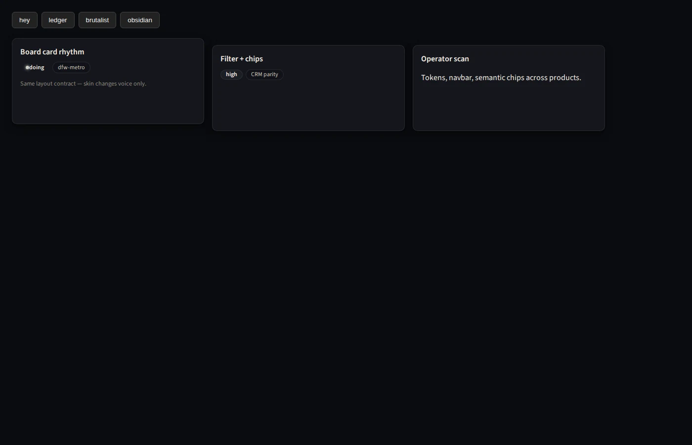
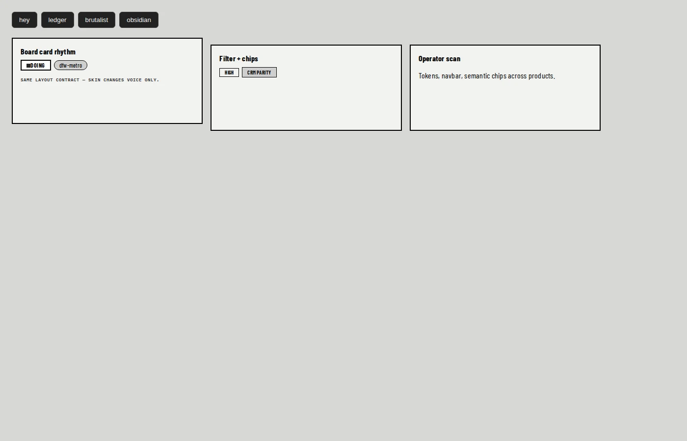
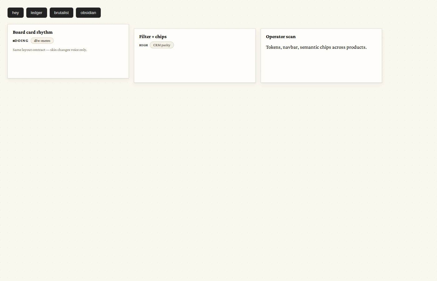
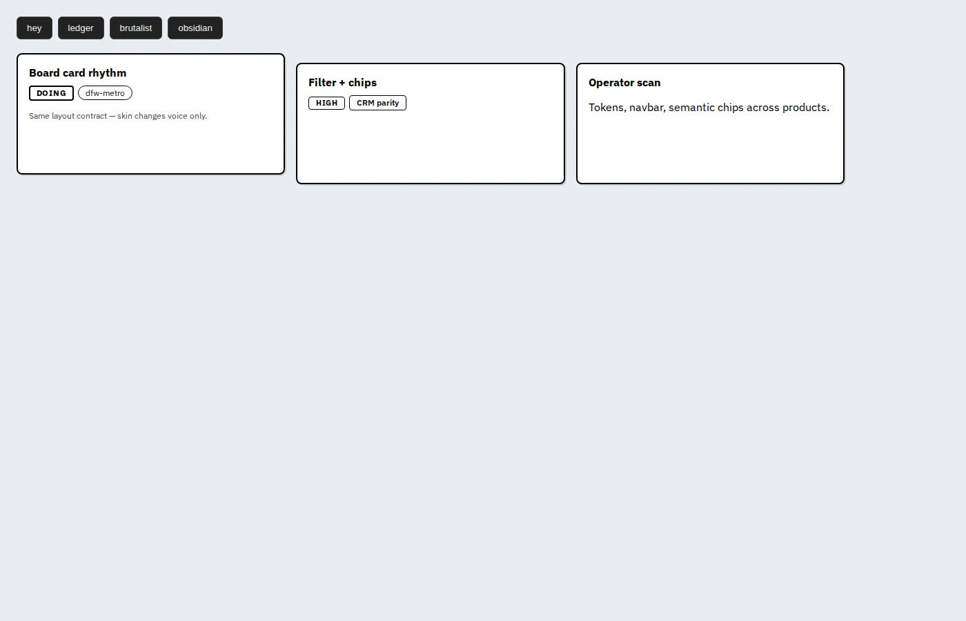
The four skins: one rhythm, four voices
A theme gallery is the easiest way to see what "tokens, not a third design system" actually means. The four Tasks comp skins on the dev host are:
- hey - the friendly default. Warm surface, rounded corners, approachable typography.
- ledger - editorial. Serif accents, structured spacing, the look of a well-kept notebook.
- brutalist - honest. High contrast, sharp edges, monospace details for the kind of operator who reads logs all day.
- obsidian - dark, dense, low-glare. Built for long shifts under fluorescent lights.
Each skin is a CSS file in public/assets/skins/, mounted by skin-lab-env.php on the dev host. Each one speaks differently. None of them change the board card contract - the card has the same image area, the same title row, the same badge row, the same footer row, in every skin. An operator moving from hey to obsidian is changing voice, not changing workflow.
This is the part of the design system that pays for itself. The contract is the hard thing to write; once it exists, the skins are variation, not rework. New skins land as new CSS files. Board card changes land as one change to the contract, and every skin picks it up.
CRM Phase 1: catching up to the family
Phase 1 of the CRM refresh landed on June 11, and it was foundation work. The PRD for visual parity (Tasks #776 / Doc #444) put it plainly: "CRM works, but looks a generation older than Sanctum Tasks." The done-when criteria for Phase 1 were a small list and a real one:
- Move to Bootstrap 5.3.3 (matching Tasks).
- Move to Bootstrap Icons (replacing the Font Awesome leftovers).
- Introduce
--crm-*design tokens that mirror Tasks'--st-*tokens, naming-wise. - Replace the purple gradient sidebar with a dark navbar.
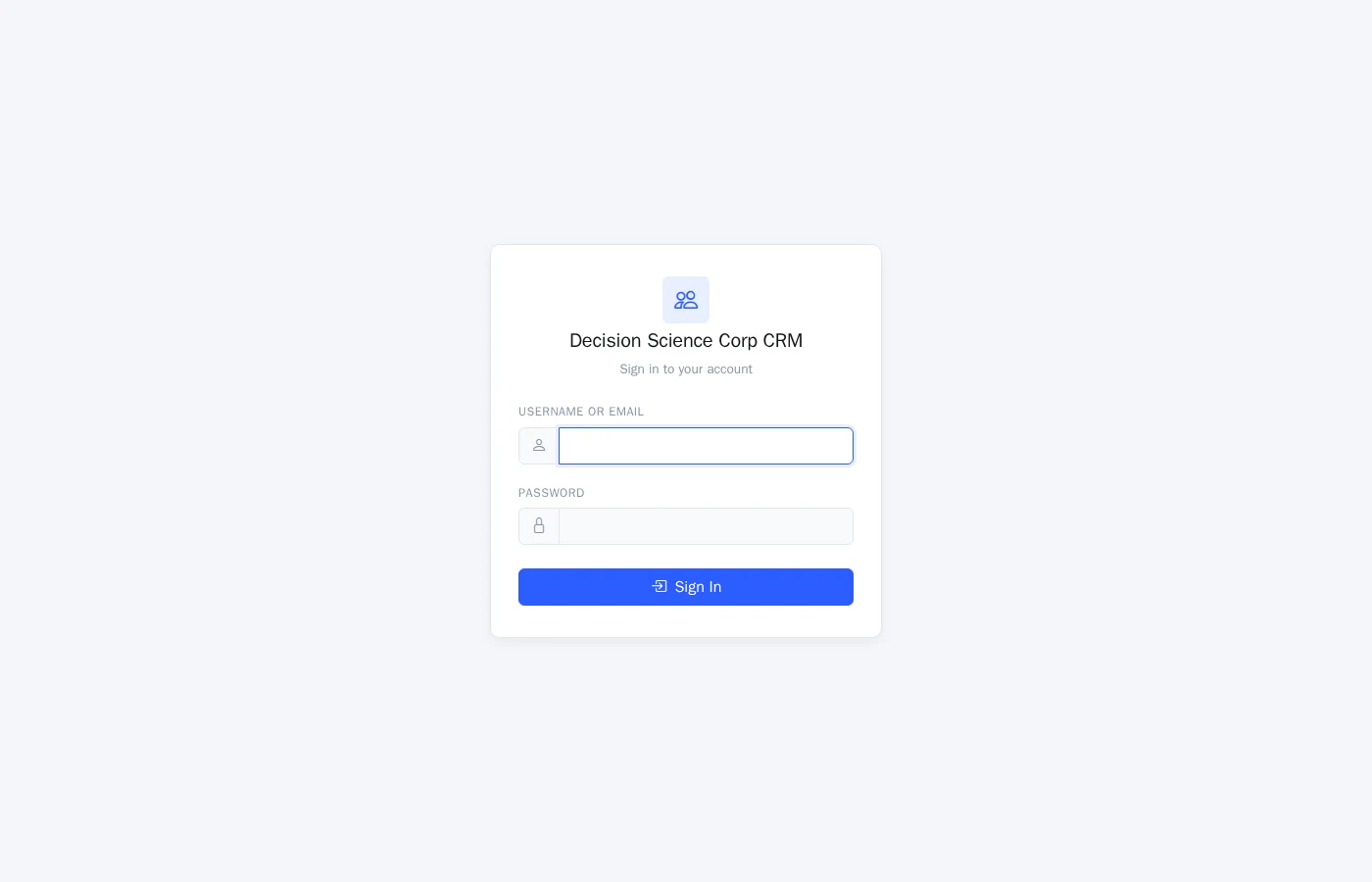
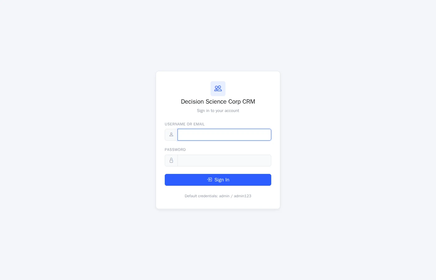
- Refresh the login.
- Extract the inline
<style>blocks fromlayout.phpintocrm.css.
None of that is glamorous work. All of it is the kind of work that you only do once, and only because you have decided that the family is more important than the parts. We did not pick these token names because they were clever; we picked them because the next person who needs to update a CRM color will already know what to type, because they have typed it in Tasks.
The dark navbar is the most visible part of Phase 1. It is also the most diagnostic. A purple gradient sidebar in 2026 is a tell - it tells you the file is older than the rest of the shop. Replacing it with the same dark navbar Tasks uses is a small change in pixels and a large change in identity. The CRM now opens the way the rest of the shop opens.
CRM Phase 2: chips, halos, and the same vocabulary
Phase 2 landed the same day and put the component vocabulary in place. The CRM had been using rainbow stat tiles - the kind of badges that try to encode ten kinds of urgency in ten colors and end up encoding nothing. Phase 2 replaced them with the same semantic chips Tasks uses:
.status-pill- a contact's lifecycle status, in one chip..priority-chip- deal priority, color-encoded but not rainbow..tag-chip- free-form tags, the kind an operator builds up over months of work..filter-bar- the consistent row of filters that sits above lists..crm-card- the new card primitive that replaces the legacy tile grid.
The dashboard also picked up a halo/chip system - contact cards get a soft halo whose color is keyed off the same status tokens, so the eye can scan a row of contacts and pick out the warm leads without reading a single label. That is the kind of detail that is easy to undervalue and impossible to give back once you have it.
The point of Phase 2 is not the chips themselves. The point is that the chip names mean the same thing in CRM that they mean in Tasks. An operator who learned what a .priority-chip looks like in Tasks does not have to relearn it in CRM. The vocabulary travels.
An operator win worth naming: DFW-metro tagging
The visual parity work is the story. The DFW-metro tagging work is the payoff. It landed on June 14, and it is the kind of feature that earns the rest of the refresh its keep.
DFW-metro tagging auto-tags contacts whose phone numbers or addresses resolve to the Dallas-Fort Worth area. The tag is just another tag in the .tag-chip system - no special chrome, no separate UI, no new vocabulary. It is a tag like any other tag, which means it slots into the same filter bar, the same search, the same view-by-tag flow that an operator has already learned.
The win is small in pixels and large in workflow. A sales lead in the DFW office can now pull a filtered list of DFW contacts in two clicks. A re-run sync updates the tags as phone numbers and addresses change. The same pattern is reusable for any other metro - we did not build a DFW-specific feature; we built a tagging pattern that happens to be useful for DFW.
That is the visual parity thesis in miniature: ship the vocabulary once, use it everywhere.
Governance: why this is not a third design system
The reason CRM is not a third design system is that the governance for skins, defaults, and overrides already exists in Tasks and now applies to CRM the same way.
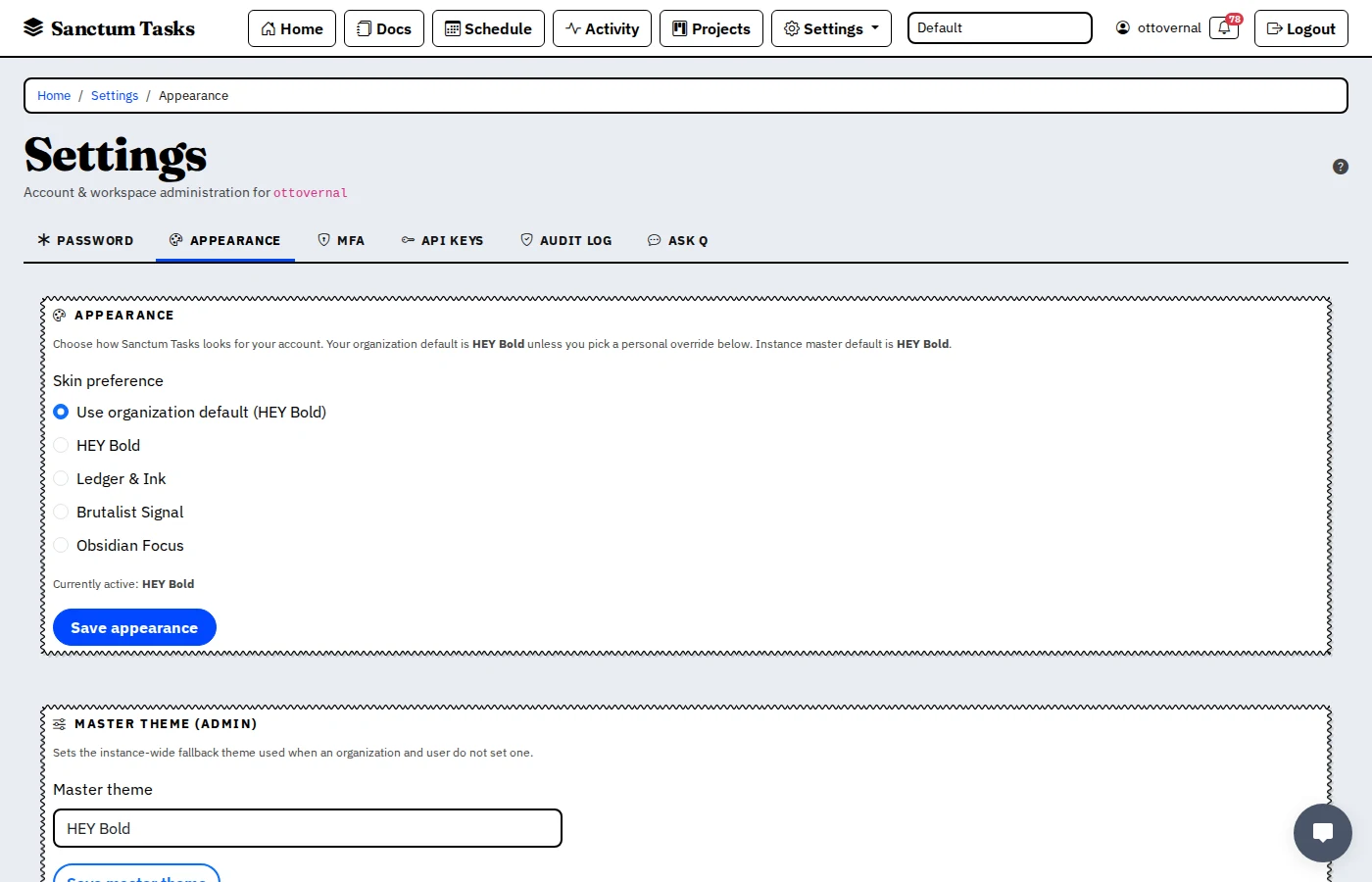
In Tasks, the resolution order for a user's skin is: user override -> org default -> admin master -> hey. The same order now applies in CRM. An admin can lock the org to a single skin. A user can pick a personal preference within that. The org default is what new users see. The admin master is the floor.
This matters because without governance, a "design system" is just a CSS file. With governance, it is the policy that decides who sees what and who can change it. Lifting the Tasks governance pattern into CRM is the part that turns "they look similar" into "they are managed the same way."
The top-bar skin switcher was deliberately disabled in Tasks for the merge commit on June 6. That was not a regression; that was the operator-level control being moved up the stack to admin. The same move is in flight for CRM. Operators do not pick skins; admins pick skins; the rest of the shop follows.
What we did not do
We did not redesign the CRM from scratch. We did not introduce a Figma-driven component library that requires a separate build pipeline. We did not fork Bootstrap. We did not write a parallel set of tokens. We lifted the language Tasks had already shipped, named the CRM tokens to mirror them, and called it a day.
That is the boring infrastructure decision the rest of the shop benefits from. The next time we change the dark navbar's hover state, we change it once. The next time we add a chip variant, we add it once. The next time an operator moves between Tasks and CRM, they do not have to remember which app they are in. They are in the same shop.
What's next
The PRD for visual parity has a Phase 3 - page-level restructures for the heavier CRM views (deal pipelines, contact detail, reporting). The June work landed Phase 1 (foundation) and Phase 2 (chips and components) on the dev CRM at dev.crm.decisionsciencecorp.com, on the visual-parity branch. Phase 3 is in flight, with page-by-page rollout as each one clears review. We are not going to call the CRM "done" until every page speaks the same language as Tasks. We are also not going to call it "incomplete" because Phase 3 is in flight - it is in flight, and we will write about it when it lands.
In the meantime, the operators who run both products have one fewer thing to context-switch between. That is the measure we care about.
If your shop has its own visual drift
If you are running more than one internal tool, and the tools do not look like they came from the same shop, the move is almost never "redesign everything." The move is to pick the tool with the most mature surface, name its tokens so the next tool can mirror them, and lift the language. Component reuse beats component reinvention. Token reuse beats token renaming. Governance reuse beats governance improvisation.
We did not invent a third design system. We just decided that the first one was a family asset.