Kitchen POS operator UI: when the line caught up to Sanctum Tasks
In early June we published Making CRM look like it came from the same shop as Sanctum Tasks — the story of visual parity across CRM and Sanctum Tasks. Kitchen POS was part of that family photo in spirit but not yet in pixels. The admin still wore an older dark-theme stack: workable, familiar to us, visibly not the same shop as Tasks when an operator bounced between products.
June fixed that. Kitchen POS admin and the channel partner portal migrated to a shared Sanctum shell — light app body, dark navbar, surface cards, semantic status pills, filter bars, and page headers that rhyme with Tasks and CRM. This post is the operator-side chapter of the Empanada Empire experiment: why we did not invent a fourth design system for the kitchen line, how we migrated page by page without a big-bang rewrite, and what changed for affiliates and prep staff.
One vocabulary, three audiences
Kitchen POS serves three humans who should not learn three UIs:
- Operators — menu, orders, config, Square wiring, partner provisioning.
- Channel partners — pickup windows, customer URLs, their order list (affiliate chapter).
- Prep staff — order board and ticket detail (often on a tablet, often at night).
The Sanctum shell work focused on (1) and (2). The order board had its own rhythm already; the admin and partner browsers were the gap. When Mark or a kitchen manager opens Tasks in the morning and Kitchen POS after lunch, the products should feel like siblings — not cousins who stopped speaking at a reunion.
sanctum-shell.css: opt-in, token-aligned
The migration anchor is public/css/sanctum-shell.css. It is deliberately opt-in: pages add sanctum-shell to <body> and pull in the stylesheet. Pages that have not migrated keep the legacy dark theme in style.css / admin-bootstrap.css until their turn.
Token names mirror Sanctum Tasks (--st-bg-app, --st-accent, status pill colors, card padding). That is not vanity naming — it is how we avoid a fourth rename pass when we lift a component from Tasks into CRM or POS. Comments in the file point at Tasks admin.css and CRM layout.php as siblings.
Light shell, dark navbar is the same contract as CRM Phase 1: the app canvas is calm; navigation stays high-contrast. Operators stare at order tables for hours; low-glare surfaces beat neon sidebar gradients.
Admin migration: dashboard first, then the long tail
The commit sequence tells the story:
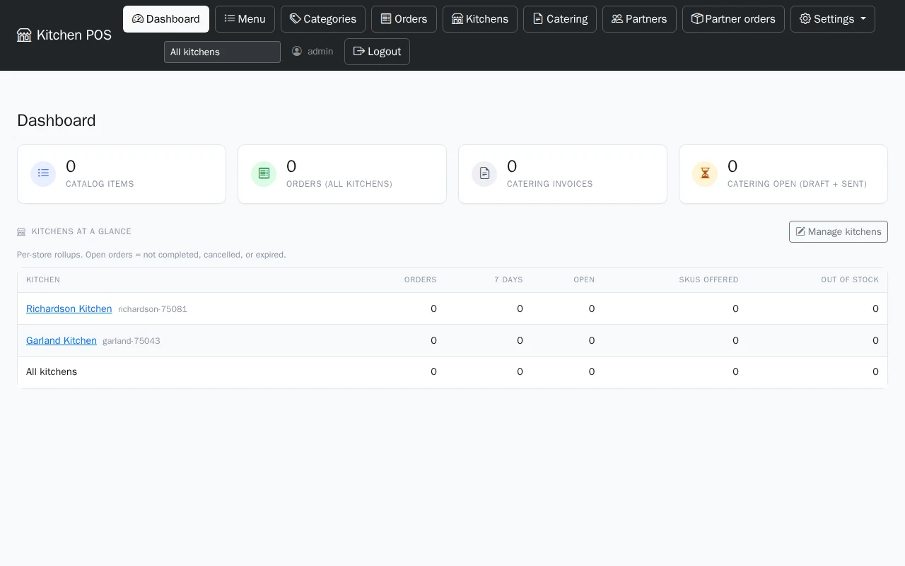
- Dashboard (
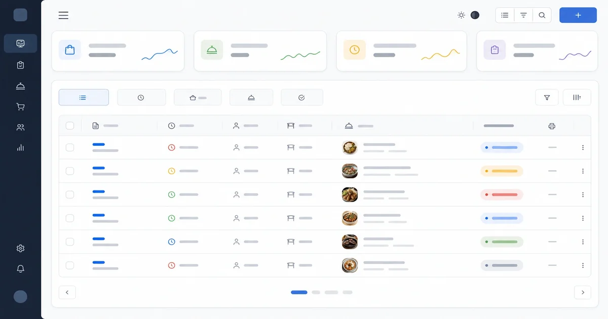
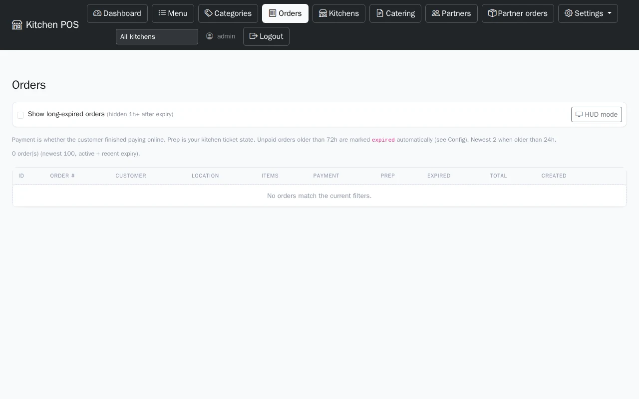
a405e5a) — surface tiles for catalog count, orders, catering, partner metrics. Section headers instead of a wall of legacy cards. - Orders (
bcc76b9) — filter bar, surface table, status pills mapped to prep states. This is the page that earns the migration — if orders look wrong, nothing else matters. - Menu, categories, locations, partners (
4dbd624) — content panes moved into shell sections. - Catering, API keys, password, partner orders (
ec471d4). - Config tabs (
2c0c087) — Square, website orders, partners, catering panels de-inlined into tabbed shell surfaces (continuing the inline-style removal work from May). - Order detail, catering invoice, edit menu item (
5318b8b) — detail pages catch up last because they carry the most one-off markup.
Page-by-page migration was a product decision, not a schedule accident. Big-bang CSS rewrites break admin at the worst time — Friday dinner rush. Opt-in body class meant we could ship dashboard and orders, verify on dev.kitchen-pos.decisionsciencecorp.com, then walk the long tail.
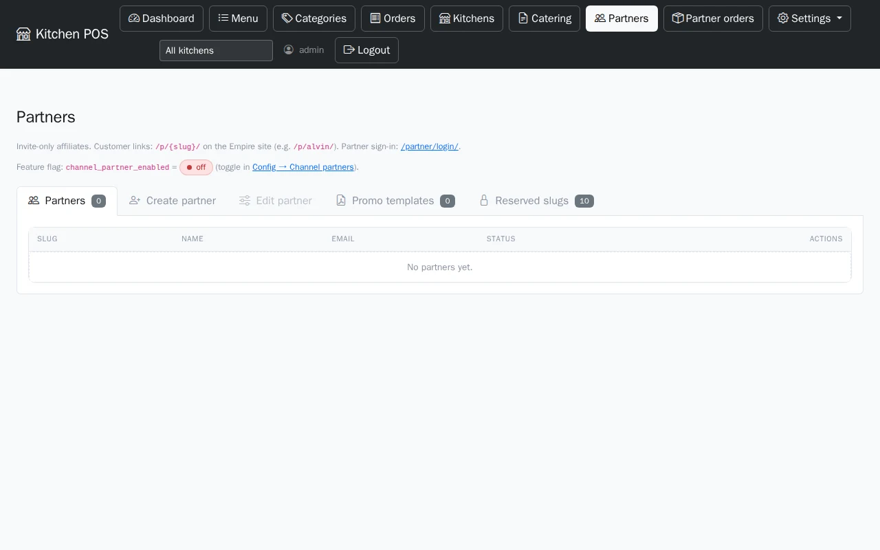
Partner portal: same shell, lighter lane
Partners are not operators. They should never see global menu edit or Square secrets. They still deserve the same visual trust as the rest of the suite.
7240530 and 35bd64d migrated the partner portal shell and page content to Sanctum components — window management, order list, promo downloads. c6bf68d polished login and magic-link pages to match admin auth styling.
When an affiliate opens their portal after we send a pickup window link, the UI should not look like a different company's iframe. Partners compare us to the consumer storefront on empanadaempire.us; the portal is the B2B half of that brand.
What operators actually feel
Before: functional dark admin, inconsistent buttons, inline styles on config tabs, partner pages that felt bolted on.
After:
- Scan-friendly tables — status pills use the same semantic colors as Tasks (
doing, priority, muted meta). - Predictable headers — title, subtitle, primary action on the right.
- Config that reads in tabs — Square settings beside website orders beside partner program flags without scrolling through a single HTML scrollbox.
- Auth that matches — admin login and partner login share the Sanctum auth layout (
auth-app bg-light).
None of this changes Square sync or menu math. All of it changes whether operators trust the console when something is wrong at 8:55 p.m.
Governance: same shop, not clone wars
We did not fork Bootstrap or import Tasks' React. Kitchen POS stays PHP templates + Bootstrap 5 — same deployment model as before. The shell is CSS and markup patterns, not a new SPA.
That matches the CRM parity thesis: lift tokens, navbar, chips, and surfaces; do not rewrite business logic. Kitchen POS still owns orders SQLite, Square handlers, and partner bridge APIs. Tasks still owns skin comp slugs. CRM still owns contact halos. The shop is shared; the repos stay separate.
What we did not do
- Order board tablet UI — not fully re-skinned in this slice; prep wall display is a different ergonomics problem.
- Consumer empanadaempire.us research layout — separate front-end repo; partner customer pages got their own June polish.
- Dark mode operator theme — Sanctum shell on POS is light-first like CRM Phase 1; Tasks obsidian skin remains Tasks-native.
Connection to the rest of June
This UI work landed beside channel partners and Square round-trip sync. Partners and Square are meaningless if the admin that configures them looks abandoned. One shop is a product promise — not only a CSS file.
Lessons
- Opt-in body class beats freeze-the-world rewrites for admin UIs.
- Orders page early — migrate the highest-stakes screen before API keys and password forms.
- Partners get the shell too — B2B surfaces are brand.
- Token names are cross-repo API —
--st-*is cheaper than another--crm-*/--kpos-*split. - Field experiment includes operator dignity — ghost kitchen software is judged when the ticket printer jams.
Empanada Empire still runs on this stack every service day. The empanadas are real; the UI is now allowed to look as serious as the ops.
Questions about Kitchen POS or the Sanctum product suite: contact us.